For this week find a nice isoline/contour map for your blog. Really try to find a well crafted example. It can be a continuous tone variation or any of the funky contour variations we discussed in class. It could also be a nice shaded relief example...but do mention that as the reason for the selection. Speaking of shaded relief, please check out Tom Patterson's excellent website dedicated to the subject: http://www.shadedrelief.com/ It has loads of examples and articles and current research into the topic. Tutorials, too!
1. No print this week! Only the online copy (so you *must* get it uploaded by 10:30am).
2. Instructions say to use the pencil tool for drawing contours in Illustrator, but I just found that the pen tool works as well. **With the pencil, you must group your contours before proceeding to the clipping step. With the pen tool, skip the grouping step. Is there a preferred way? Ungrouped pen tool contours can be adjusted post-clipping mask using the Subselection tool. I like that!
2. Make sure you are drawing closed polygons, not just arcs that extend to the edge of the boundary. With the cliping mask, anything extending outside VA will be trimmed off.
3. Make sure you add labels indicating the level of your contours! They can be just simple 10, 20, 30, etc. You can place them above the line, in concert with the contour (with a small break in the line) or potentially dividing the line. I didn't give specific rules so go with what is clear and logical.
4. Be creative with the map! It is relatively simple graphic-wise: map, legend, title, scale, and identifying info. Legends do not have to be a box with a line of boxes within (push yourself). We are full color now so add a non-white background (subtle but different). Make sure VA is filling your defined space. Remember that Smerg is BAD.
5. Since this is an online-only map, graphic scale is needed. If you have RF or verbal, you can translate that into a graphic scale easily. Work to make a clean scale that lets the map be the most prominent component. Remember to add units (miles or km).
**If you miss the demo on Tuesday about how to determine the contour lines please ask (prof or a classmate). Don't just eyeball it!
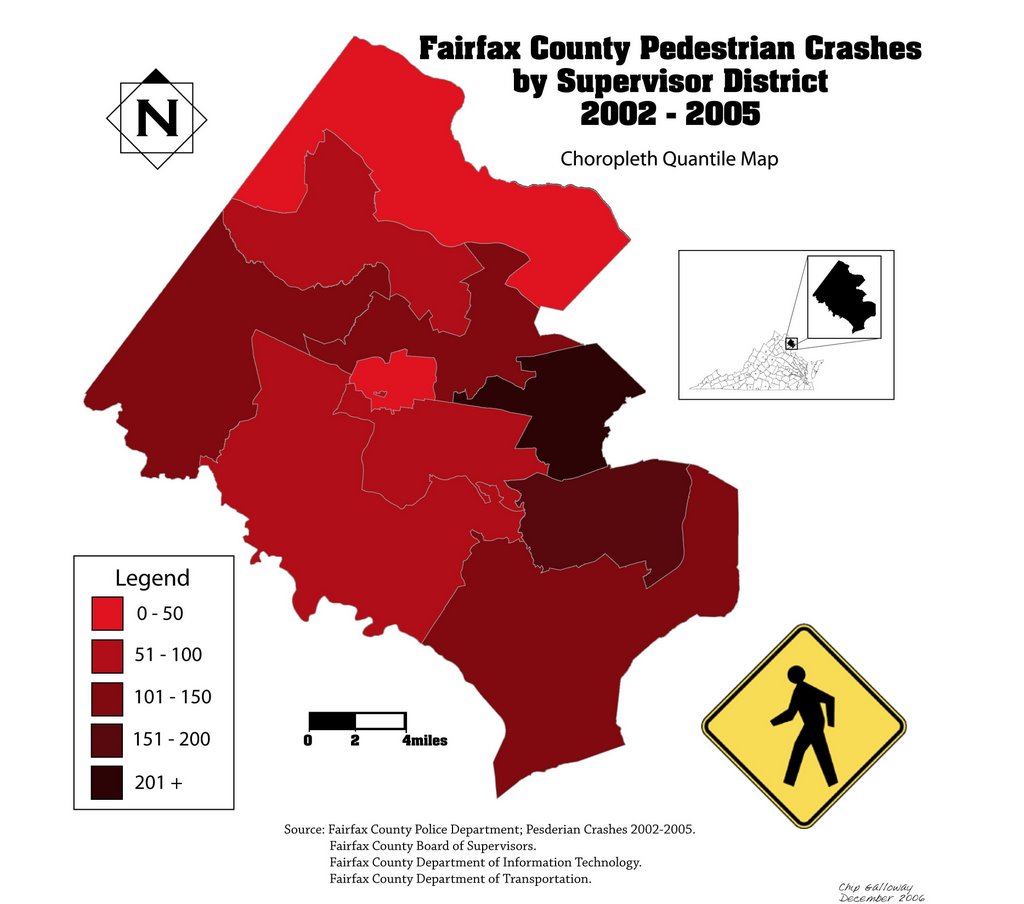
Some graphics of isolines:


James Niehues -- shaded relief maps: http://www.jamesniehues.com/
The go-to site for shaded relief info: http://www.shadedrelief.com/
The ColorBrewer is fantastic for color classification schemes, but they aren't necessarily the best for the overall color palette of the graphic. I consistently find professional looking maps have colors that harmonize.
Not sure where to start? Here are 2 sites for color inspiration and palettes: Kuler and ColourLovers Both sites have loads and loads of color combinations and use descriptive tags to describe the colors. Need a color to represent "happy?" Type it is as a keyword and see what others think. The sites themselves are also nice examples of design -- good layouts, interesting use of fonts and the like. Check them out...maybe they will inspire you.
A new one to add is Daily Color Scheme
And the very interesting Flickr color pickr
Even shopping sites use color as a tool: Etsy color searcher
Info on the 3 variations: http://www.iamcal.com/toys/colors/
Another article: http://www.eyecaresource.com/conditions/color-blindness/
Visual test: http://www.lensshopper.com/eye-disorders/color-blindness.asp#test
Color vision deficiency simulation: http://www.tsi.enst.fr/~brettel/DaltonDemo/DD08.html
Good site for general info and links: http://www.toledo-bend.com/colorblind/Ishihara.asp
Less than a week till the big 2012 presidential election. Every news organization and loads and loads of other sites have their own versions of how the polls map. Although Presidential election data is most popular, any upcoming election info is fine. For this posting, an interactive map is okay. Find a map you particularly like and explain what sets it apart.
Since this is *color* week...how does the map you selected use color? If it is qualitative data, do the colors really appear even visually? Does a particular color have a slight bias?
I strongly recommend using ColorBrewer for your color maps. It is a great launching point for both sequential (quantitative) and qualitative schemes. You can always modify the color ramps in Illustrator...but these are proven and safe.
Here is another color websites: http://colorschemedesigner.com/
As you have surely heard, the University is closed all day Monday and until noon Tuesday. By 8am Tuesday they will decide about the remainder of Tuesday. So...our lecture is officially cancelled and the lab is up in the air. I'm going ahead and canceling our lab on Tuesday. The winds will be strong all day and power will likely be out in many areas (mine included). I don't want any of you trekking to campus.
We will meet again on Thursday, Nov 1st. Lab 7 is due on Thursday as well.
Stay home, stay dry, and enjoy this unique weather event!
(if you haven't yet done so, check out the posts on the Capital Weather Gang's blog: http://www.washingtonpost.com/blogs/capital-weather-gang# Great maps and reporting)
So it looks like we are in for an exciting week weather-wise. In anticipation of what appears to be dramatic wind and rain starting Mon afternoon and running through Tuesday, I am pushing back the due date of Lab 7 (the dreaded dot density lab). My neighborhood is prone to losing power and I want to send out this info before I'm internet-challenged.
**The new due date for Lab 7 is this Thursday, Nov 1st**
Please try to get your lab completed pre-Sandy (especially if you need to use campus computers). Lab 7 takes more time than prior labs (it is not hard, just time consuming). Remember there is a free 30-day trial of Illustrator offered through Adobe (very handy, but can only be used once).
As for class on Tuesday, it is too early to say if the University will truncate classes or close altogether. The Capital Weather Gang's storm predictions (http://www.washingtonpost.com/blogs/capital-weather-gang#) are pretty impressive...and they have a good track record. Fairfax County Public Schools will surely be closed but GMU is harder to predict. Make sure you check your email before departing for class on Tuesday!!
Whatever the outcome of Sandy, stay safe and enjoy the storm!